|
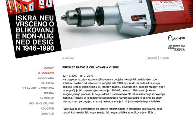
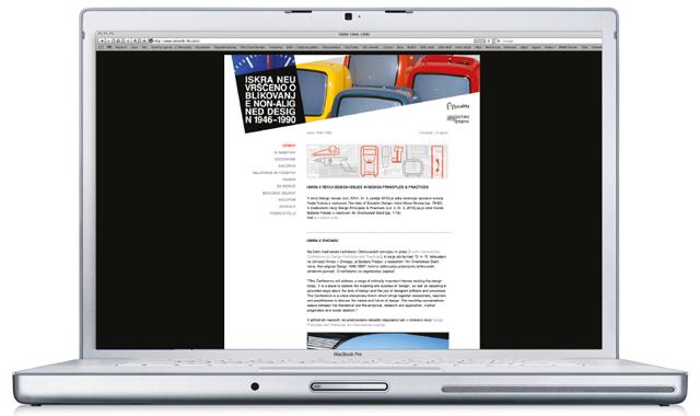
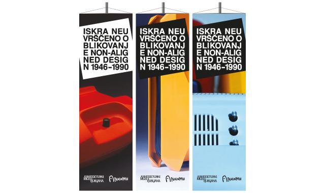
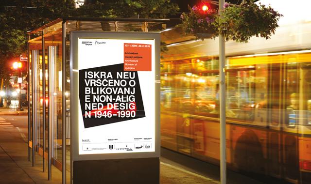
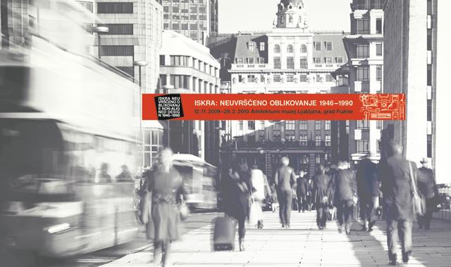
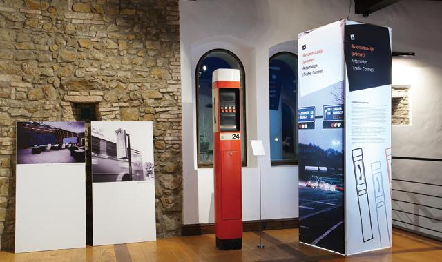
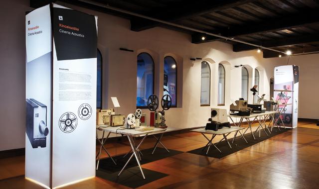
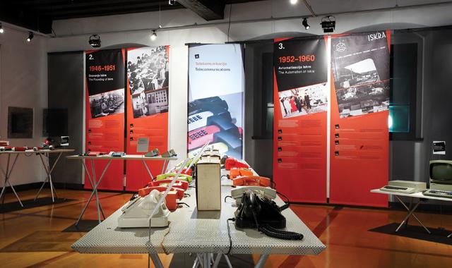
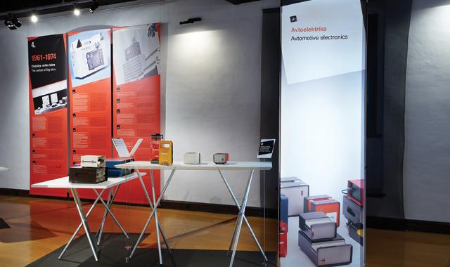
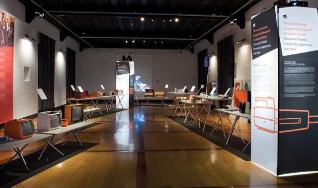
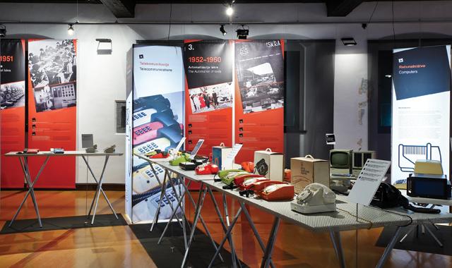
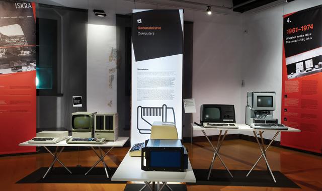
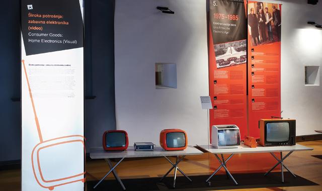
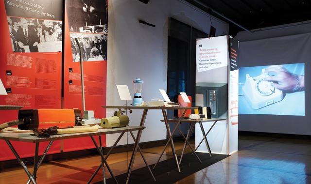
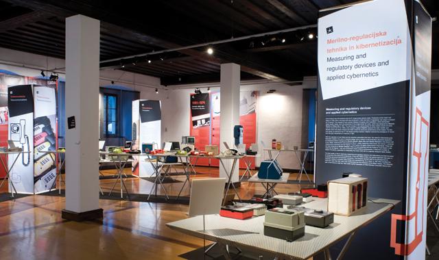
The exhibition provides detailed insight into the role and development of design in Iskra, a renowned Slovene company, from the latter's founding in 1946 to its breakup in 1990. The project consisted of designing the exhibition, its identity and all its communication / promotion materials. The task required achieving a design solution that was homogenous with the exhibited products and their design language (and showed how forward thinking and modern these artifacts were for their time) whilst avoiding evoking a "retro" feeling. The design solution was realized with Iskra's corporate graphic elements and layouts, but in a fresh, innovative way. Special attention was devoted to visual ergonomics - positioning, text sizes - in order to provide the optimal viewing experience for visitors.
Additional information about design solution:
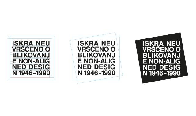
_Iskra was among the first companies in Slovenia that used Helvetica as part of their corporate identity. Hence, we decided to use the font as the key feature of the exhibition's identity.
_Iskra's printed materials had strong layout design. We emphasized and displayed the layout grid in the exhibition's catalogue.
_We avoided using Iskra's brand logo. Several companies have been using Iskra's original logo or parts of it since Iskra's breakup in 1990. Using the original logo for the exhibition would therefore create confusion.
_We used the square for the logo of the exhibition because of its strong link to the identity of Iskra's original logo.
_The diagonal is also reminiscent of Iskra's identity. It's present in the logo and all the graphic material. It also appears in the design of the exhibition.
_The design of the logo and the communication material is straight, bold and modernist - a hommage to Iskra's approach to design.
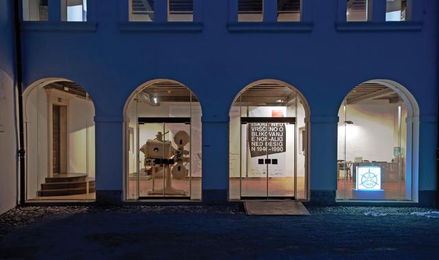
_The exhibition will travel across Europe. All materials (including the logo) are therefore both in Slovene and English.
_We used line illustrations of several products as a tribute to their original packaging design.
_The main goal was the realization of a small budget exhibition that is nevertheless recognizable and memorable.
|
|
Business case:
Create a recognisable identity and achieve good communication despite a very small budget
Exhibition design:
Jure Miklavc, Jaka Verbič, Jože Carli, Barbara Šušteršič
Visual communications:
Barbara Šušteršič, Jure Miklavc
Illustrations:
Jože Carli
Curators of exhibition:
Barbara Predan, Cvetka Požar
Photo of exhibition:
Domen Pal
Organiser:
Museum of Arhitecture and Design MAO and Pekinpah Association
Year:
November 2009
Recognition:
Two Brumen recognitions of excellence
Link:
http://iskra46-90.com
Media:
Mladina
|
|